Designing Lakeshore’s Copper Building
With brand new homes at Lakeshore’s Copper Building just weeks away from launch, we’ve had a chat with Bristol-dwelling architect Nick Brown of Ferguson Mann architects, who’s given us a teaser into the design of the new scheme...

What was the design inspiration for the Copper Building?
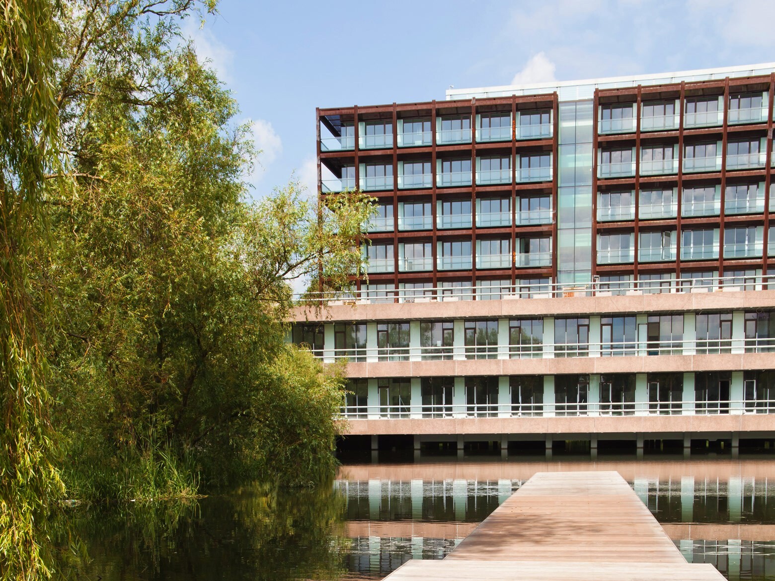
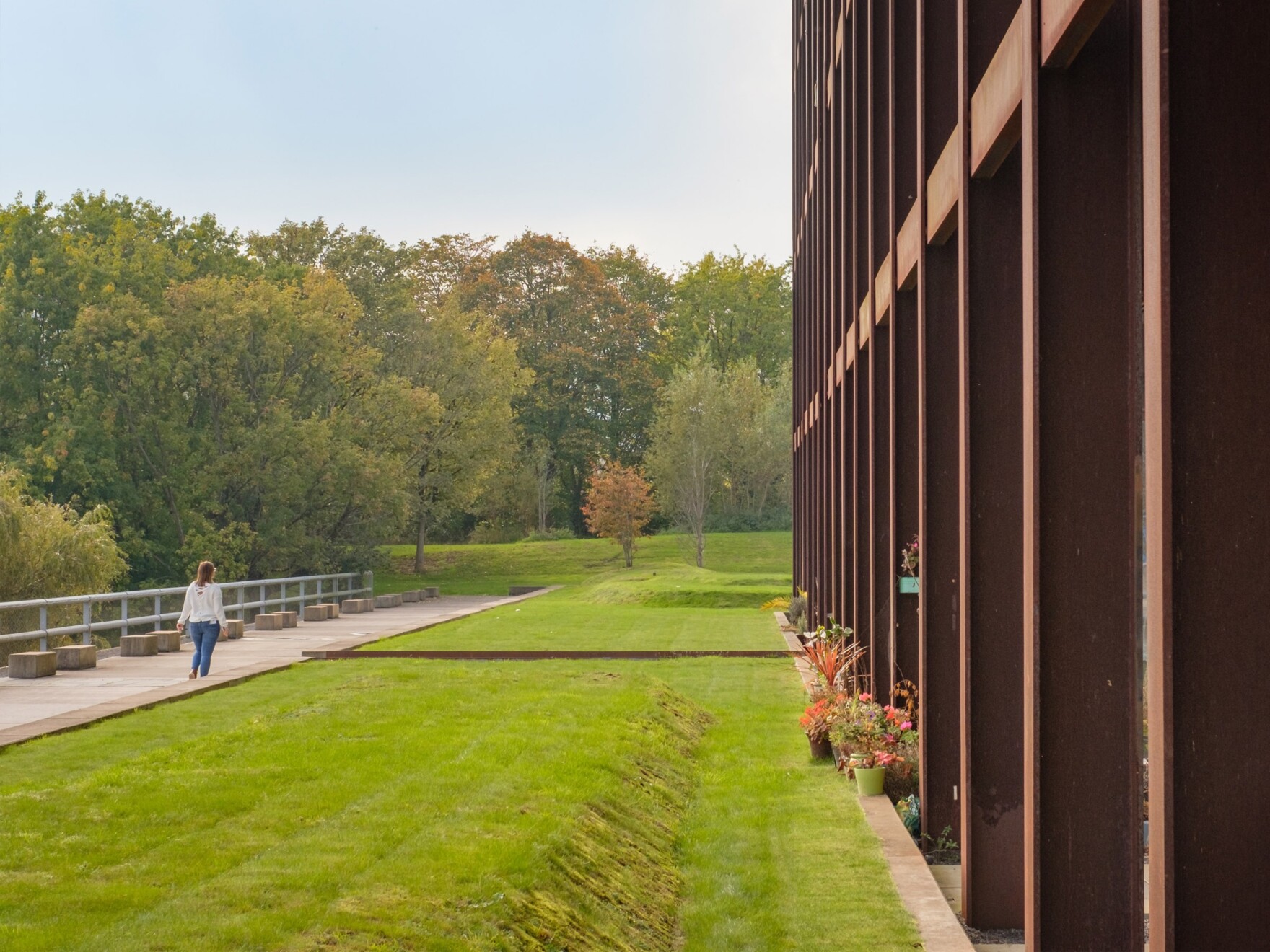
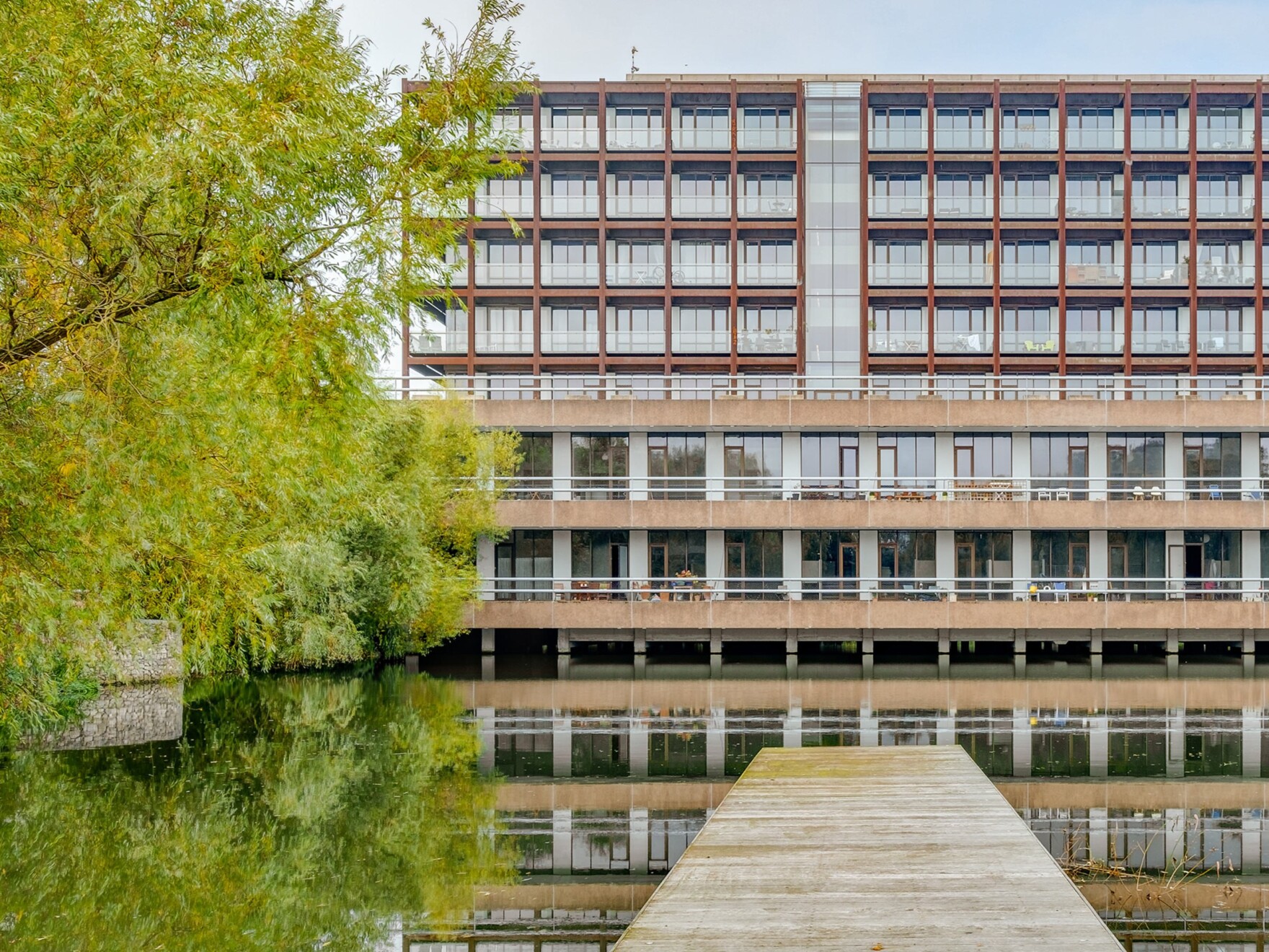
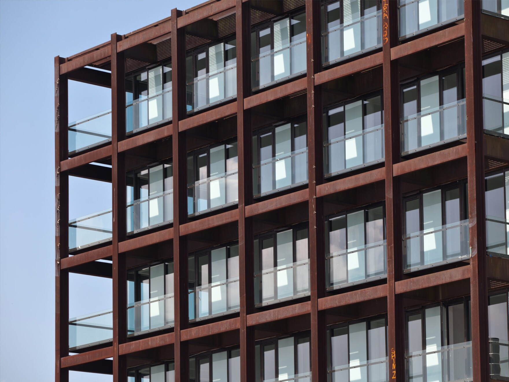
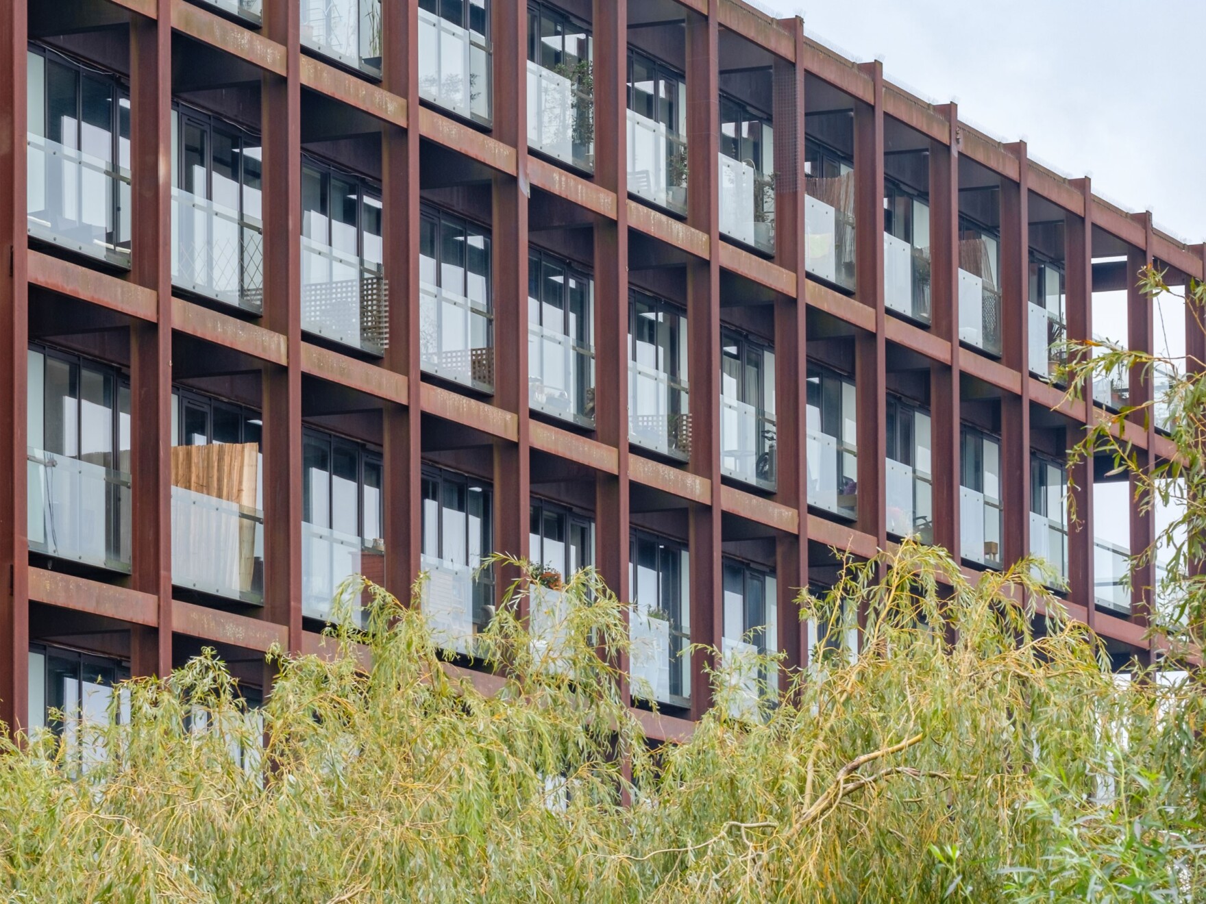
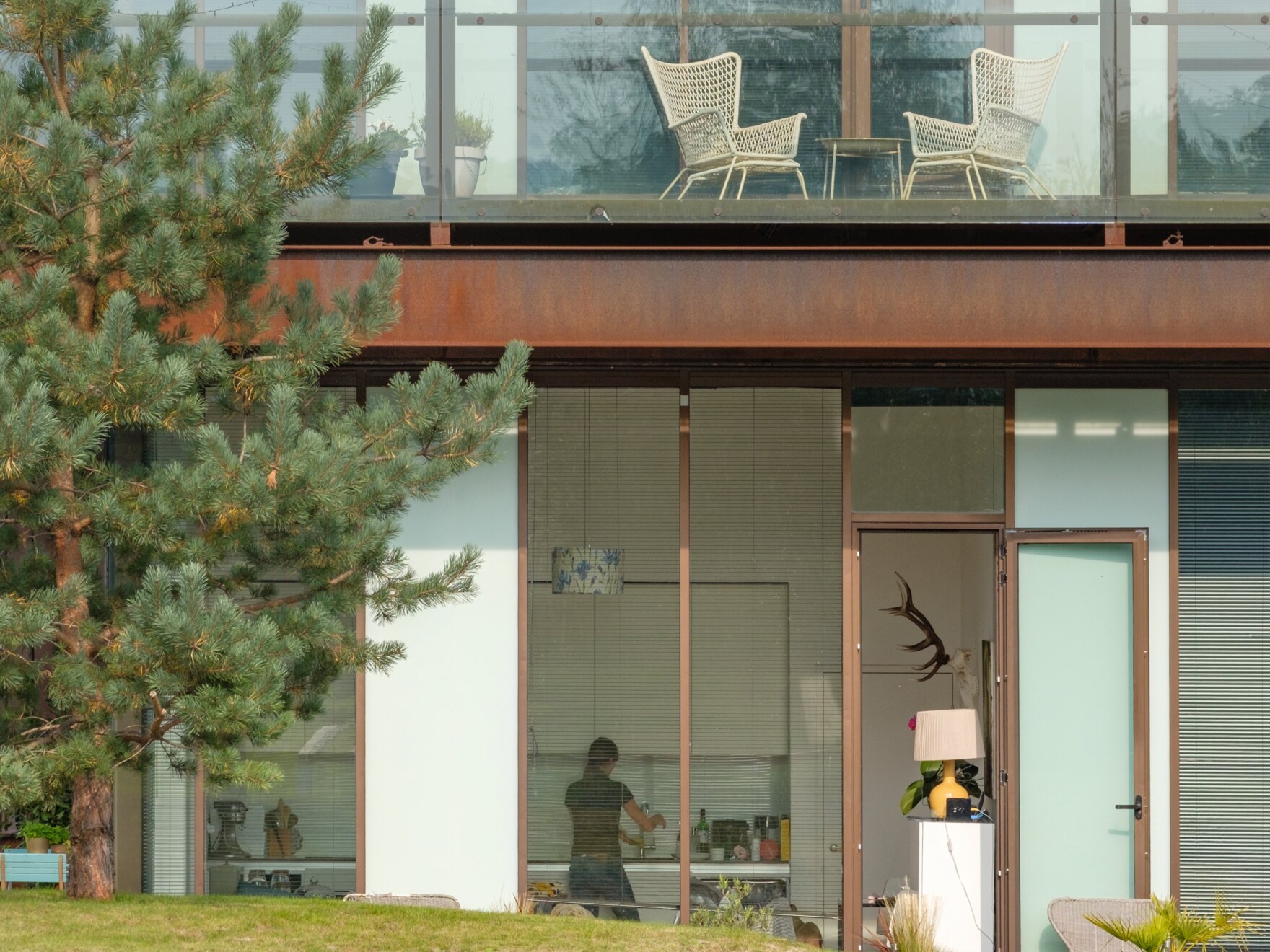
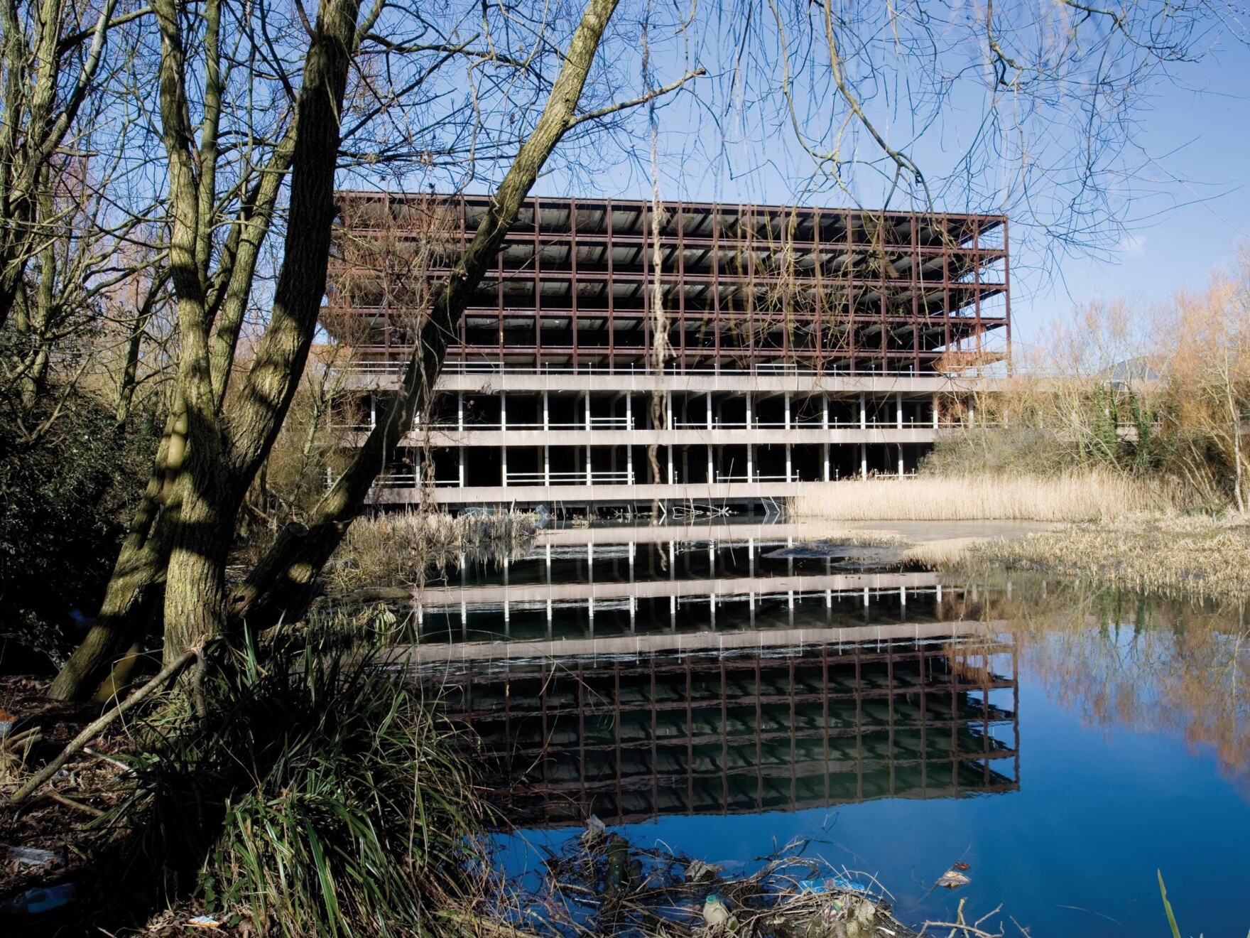
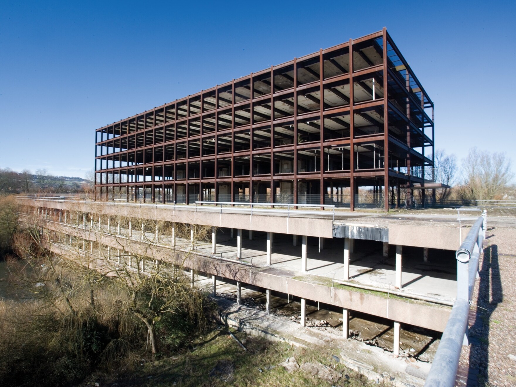
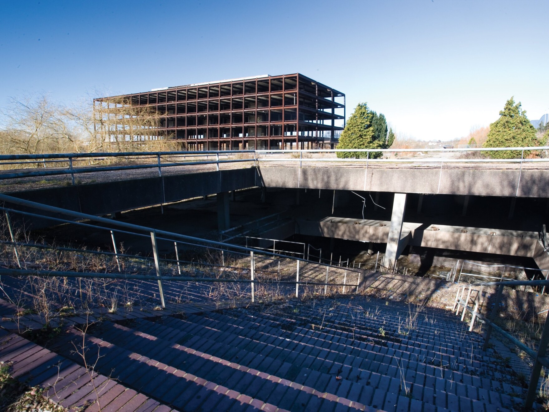
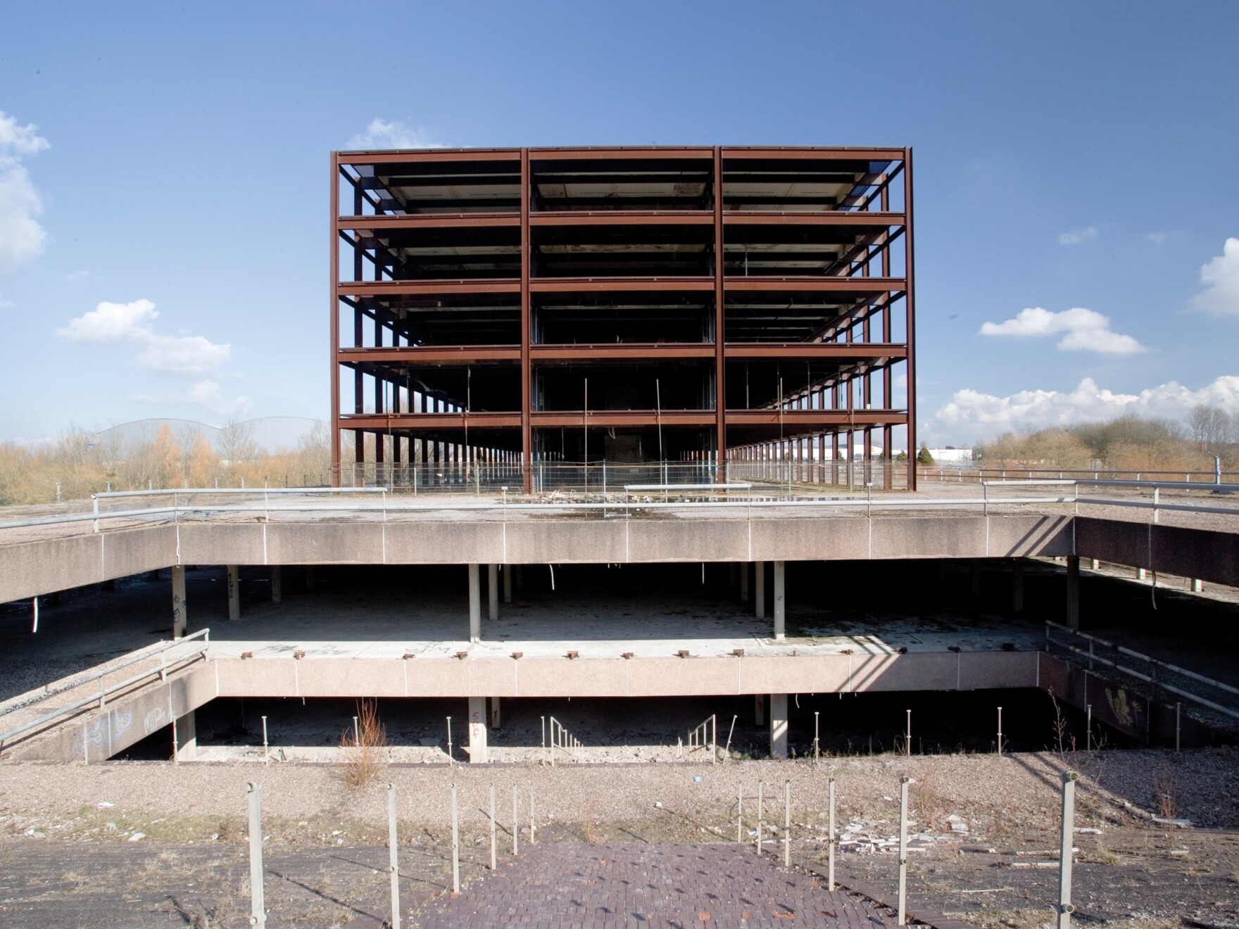
“The form and language of the Copper Building was always intended as a reference to the previous, Cor-Ten clad Imperial Tobacco factory building that occupied the northern edge of the site, prior to its demolition in 1997-8. This was an incredibly significant industrial building, not just for the local area, but Bristol as a whole. Without the factory building here the northern edge of the site felt incomplete, so it was a simple decision to create a new building that would complete the enclosure of the parkland and address the retail park to the north.”
How has the design taken inspiration from the local environment?
“Bristol has a rich maritime history, and the floating harbour is lined with a fantastic array of post-industrial buildings that have been given new life over recent years, alongside a flurry of new developments. Water-side living, and working is synonymous with Bristol.
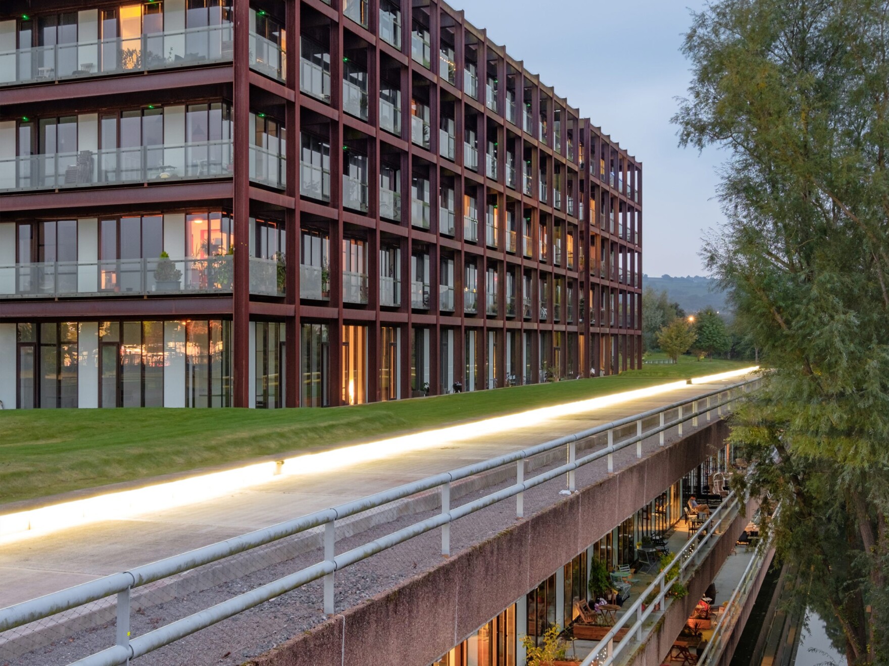
“However, at the Copper Building, this isn’t just another water-front apartment development, these apartments are situated within their own 10-acre parkland and lake, also offering wider views across the landscape of south Bristol – country living within an urban environment.”

Are there any hidden design elements weaved into the designs?
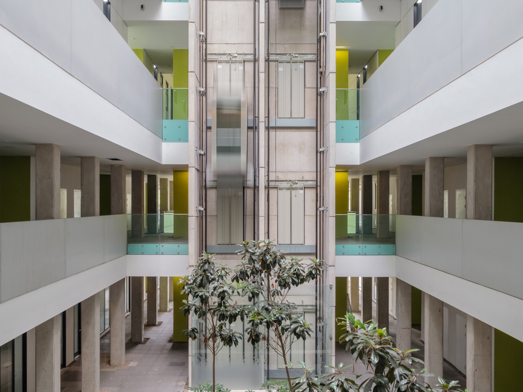
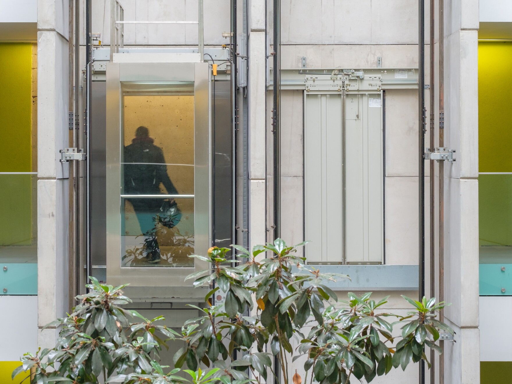
“I always enjoy experiencing a bit of a surprise when seeing the inside of a building compared to your pre-conceptions from outside – and that is a case in the atrium and common areas of the Copper Building. This was certainly the case with the earlier Lakeshore building where the internal atrium is a complete contrast from what you see externally, to the extent that you could be somewhere else. I find that quite refreshing.”
How do the designs work alongside the original Lakeshore building? Was the intention to mirror the aesthetic there?
“In my opinion, two adjacent buildings such as Lakeshore and the Copper Building can have a ‘conversation’ with one another, without needing to mirror or copy each other. There are subtle and not-so-subtle similarities between them, but I would like to think each building maintains their own unique identity and personality.”

What design challenges have you faced along the way?
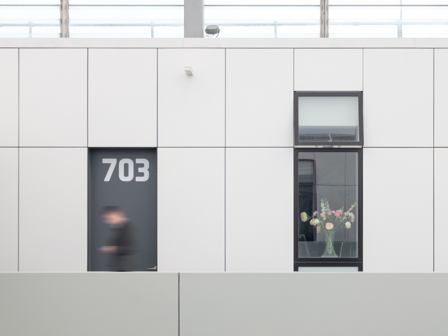
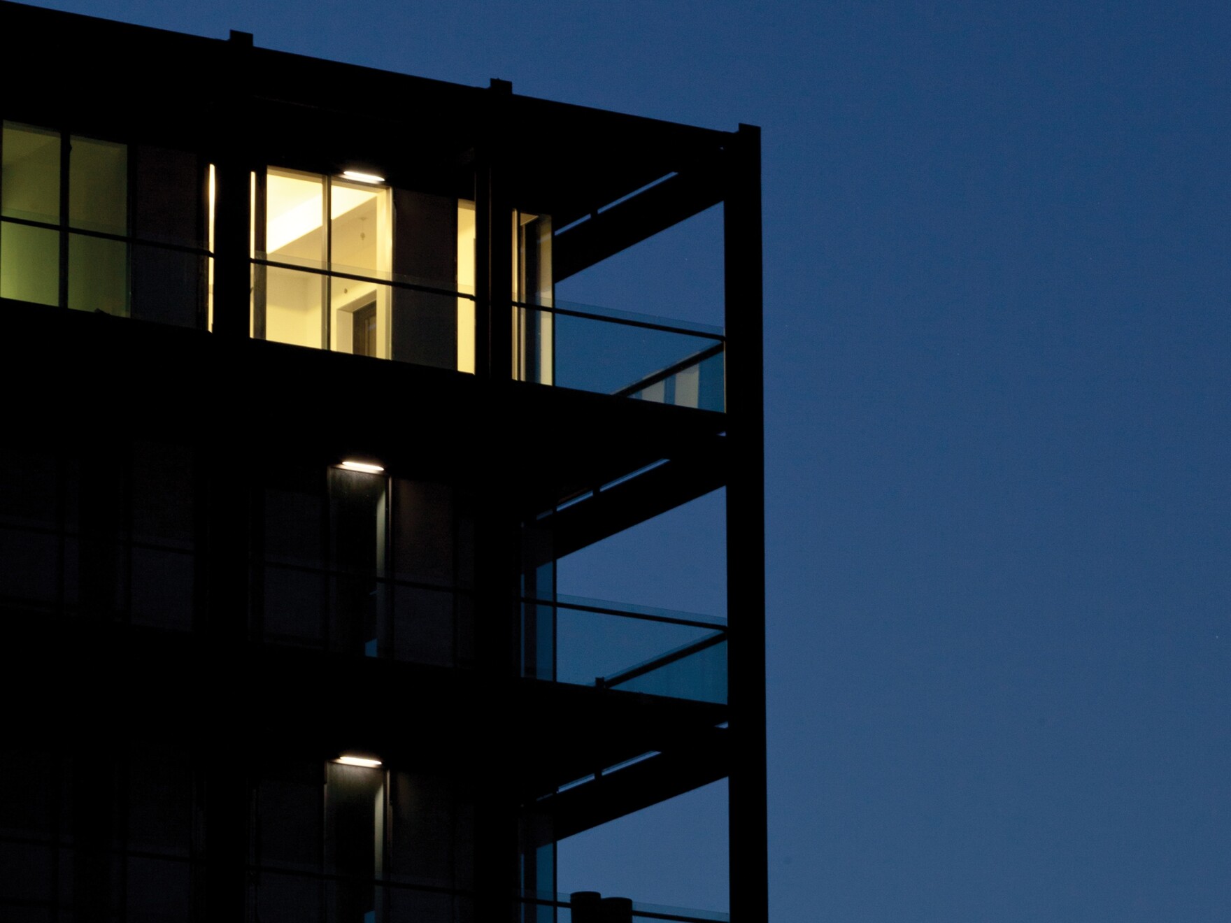
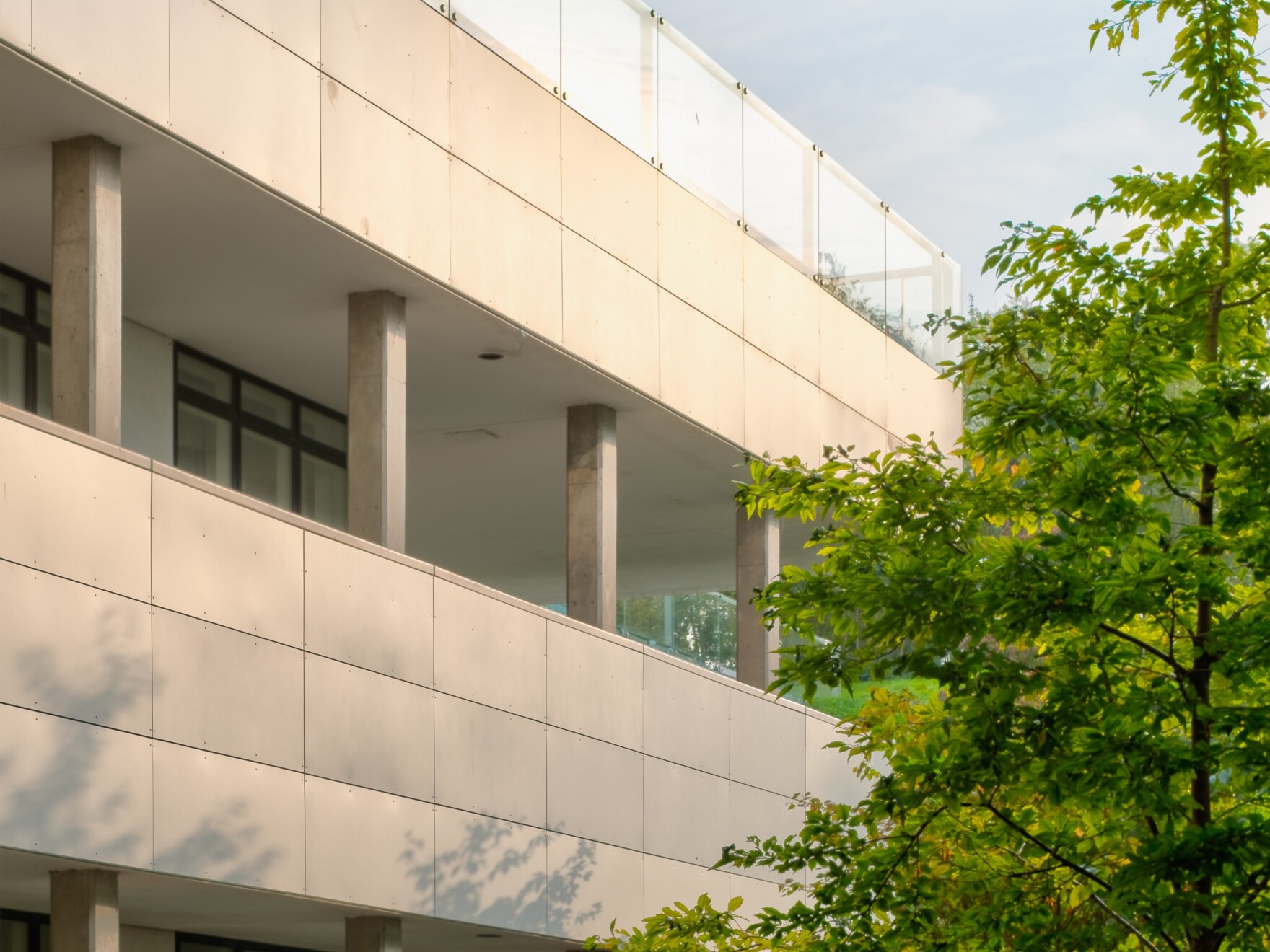
“A particular design challenge was maintaining some fun and visual interest in the façade of a building that is 170 metres long! If you look at the north façade from the retail park, the window fenestration at first feels quite random and arbitrary, but the longer you look the more you can make out an underlying structure of bays and a rhythm with the windows and seams in the copper cladding that tie everything together.”
What is your favourite design feature at Lakeshore?
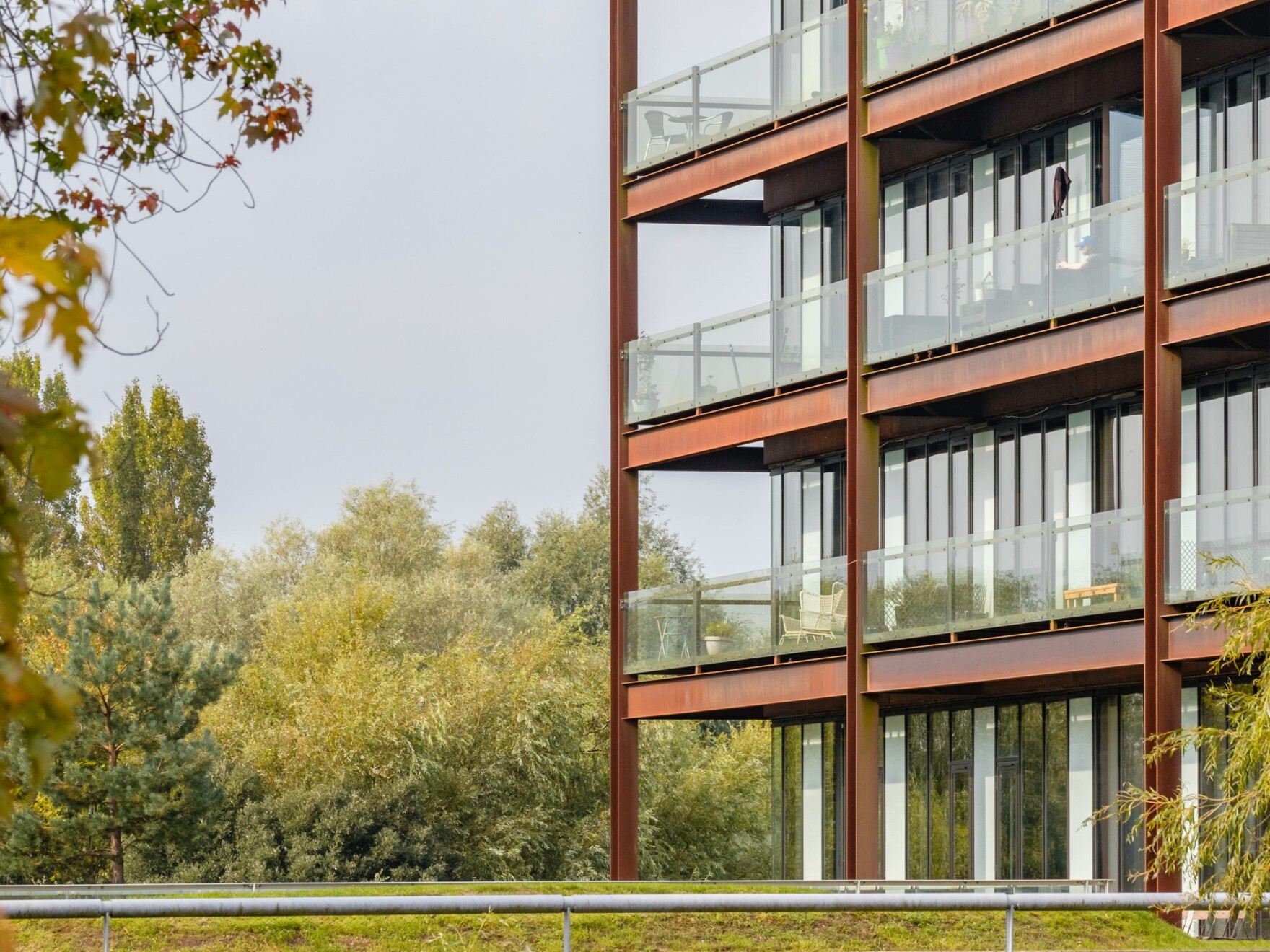
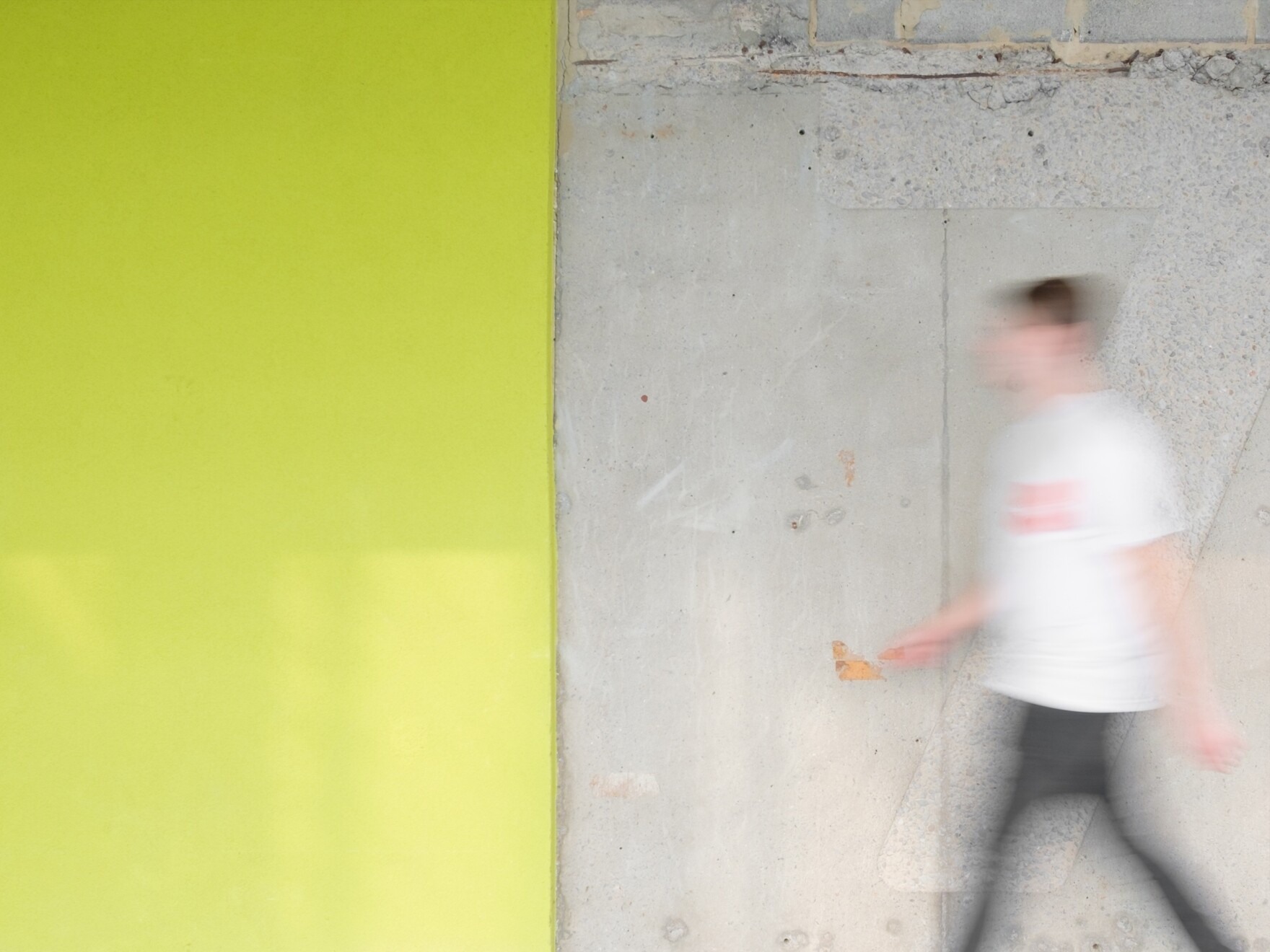
“I like the contrast between hard, metallic finishes and the softer, warmer timber finishes. This is apparent with the timber inner linings to the balconies, but also pops up elsewhere inside the building such as the full-height concrete walls in the atrium that were carefully formed using timber planks rather than conventional shuttering materials and therefore the indentation of each plank and the timber grain is left on the wall as a permanent reminder of how it was made.”

How did you ensure the building worked with the vast outdoor space and that the residents would benefit from views of their green surroundings?
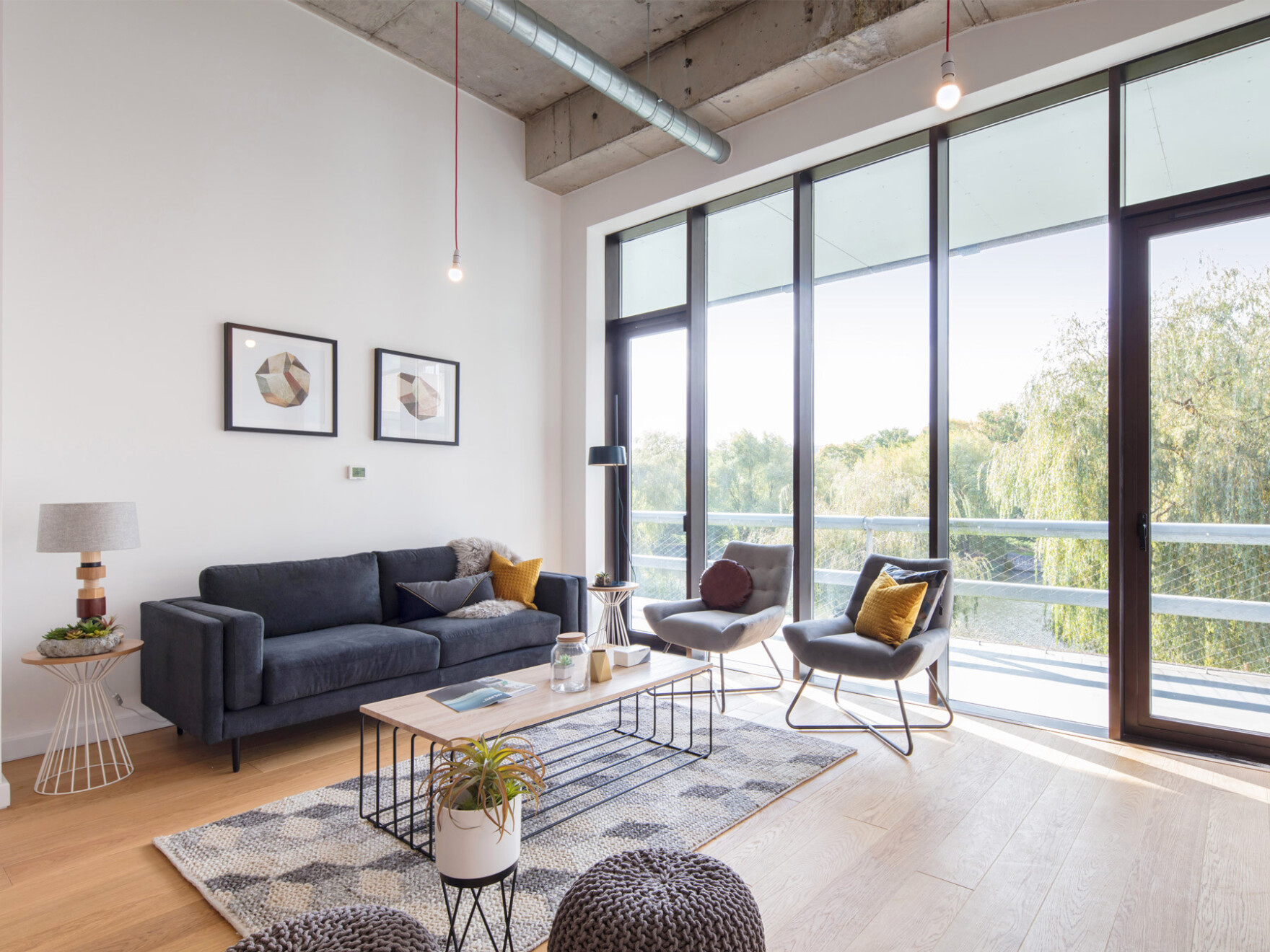
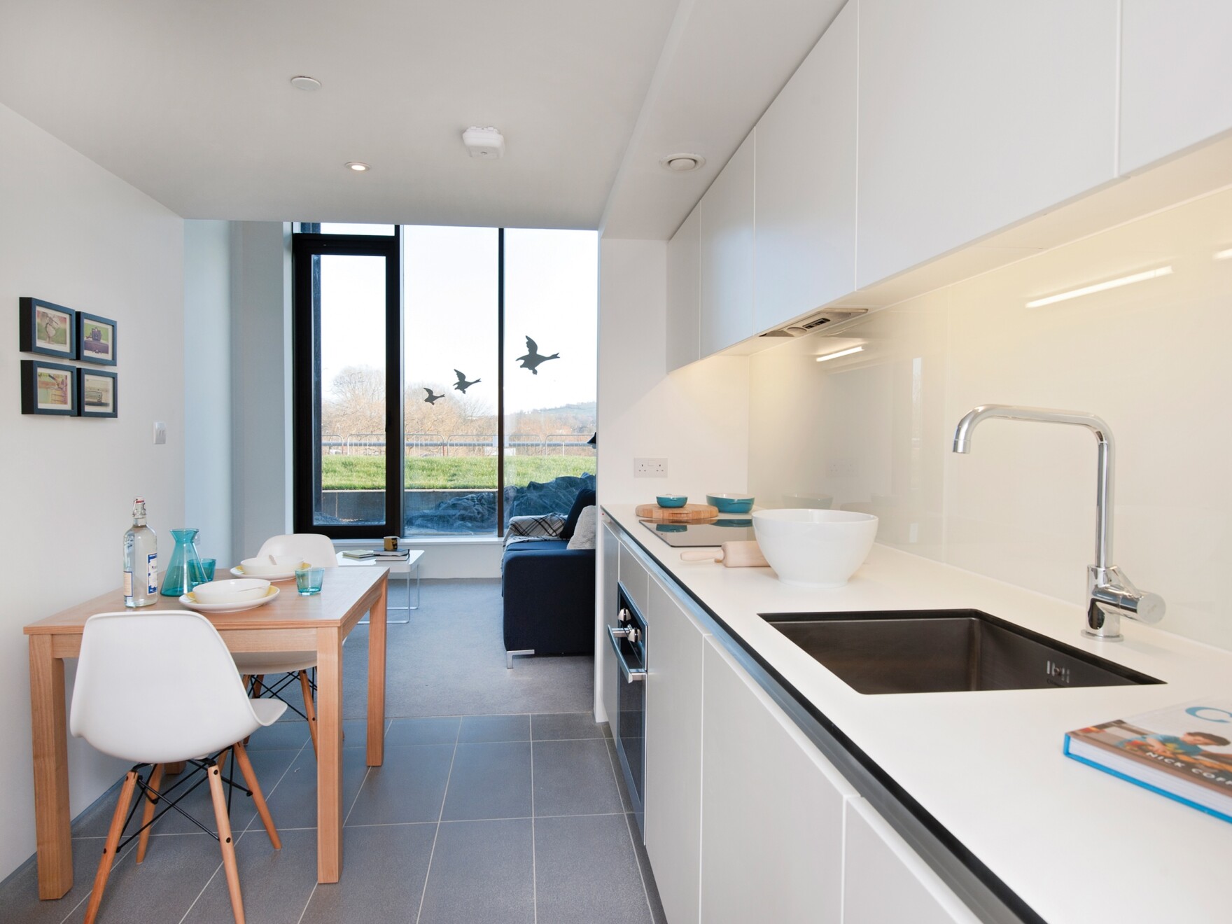
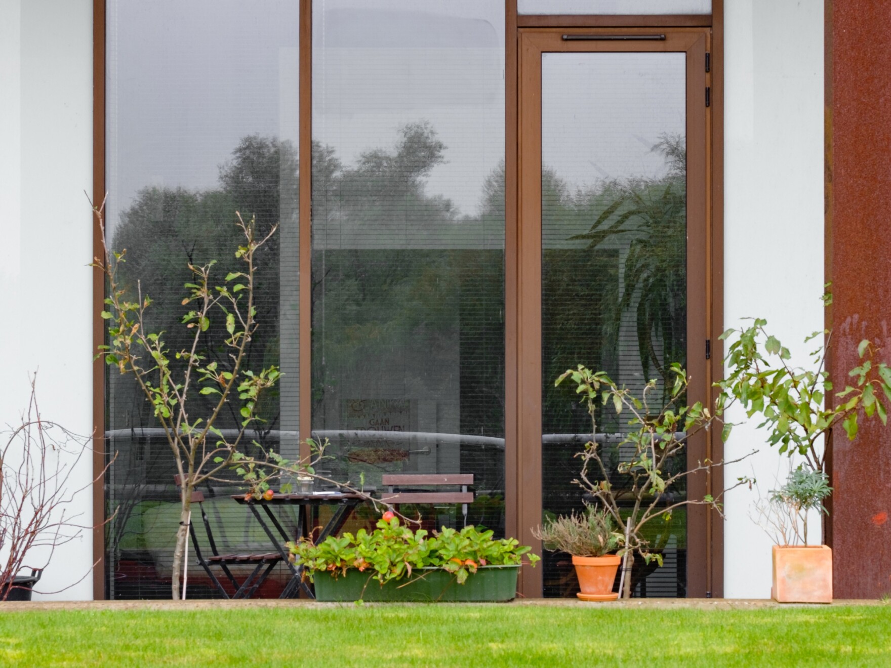
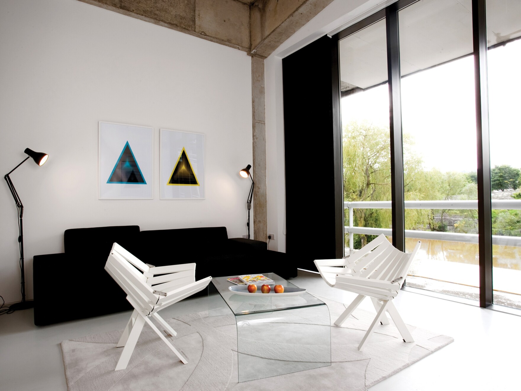
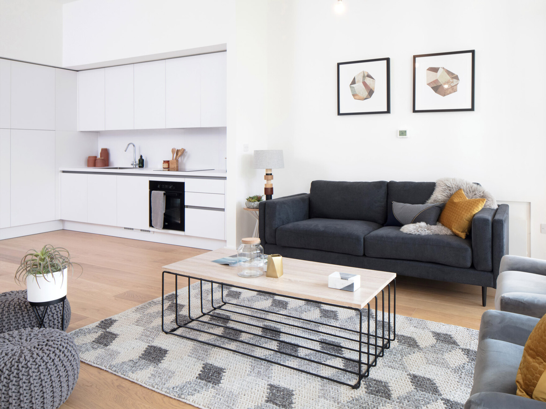
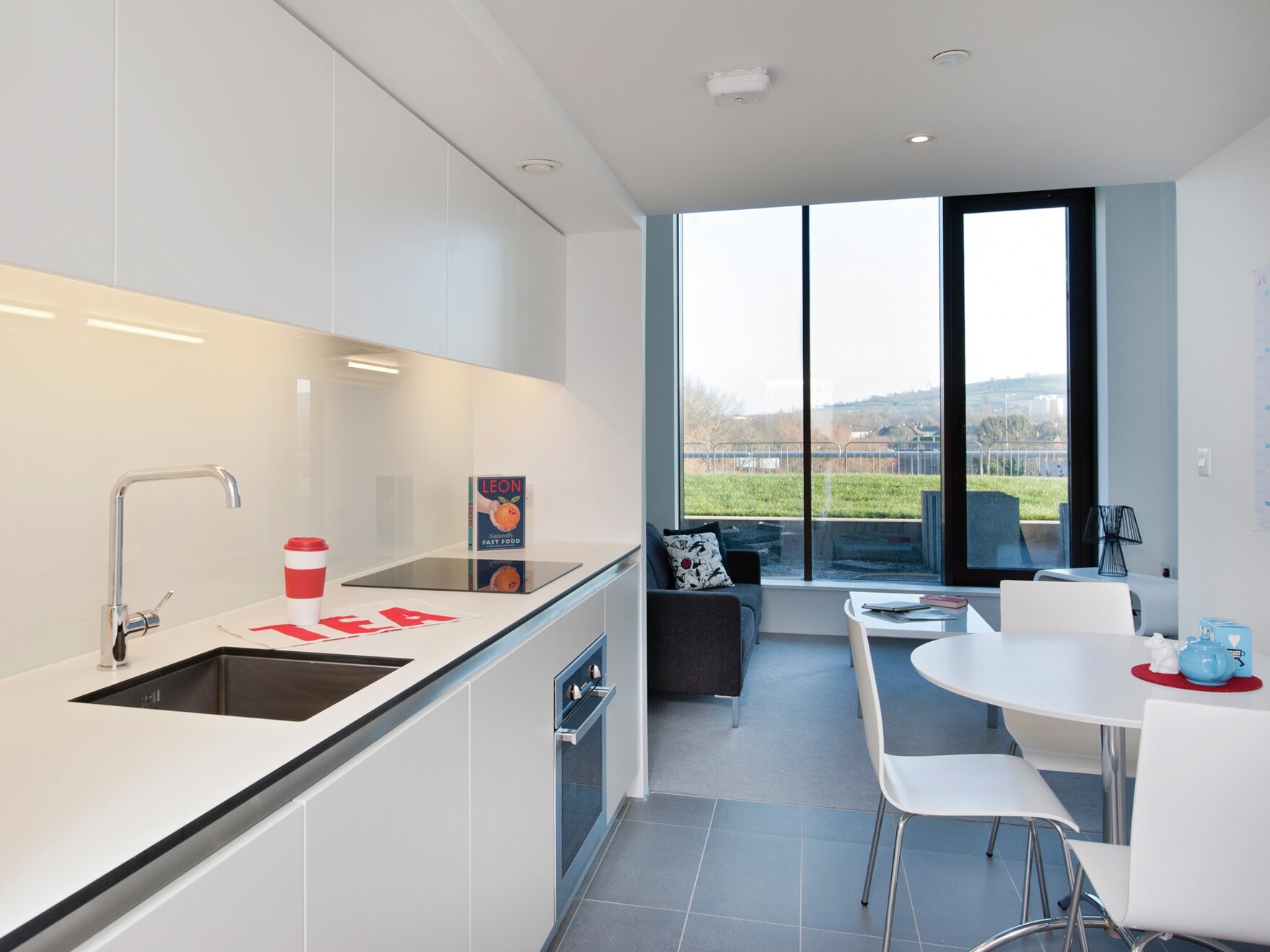
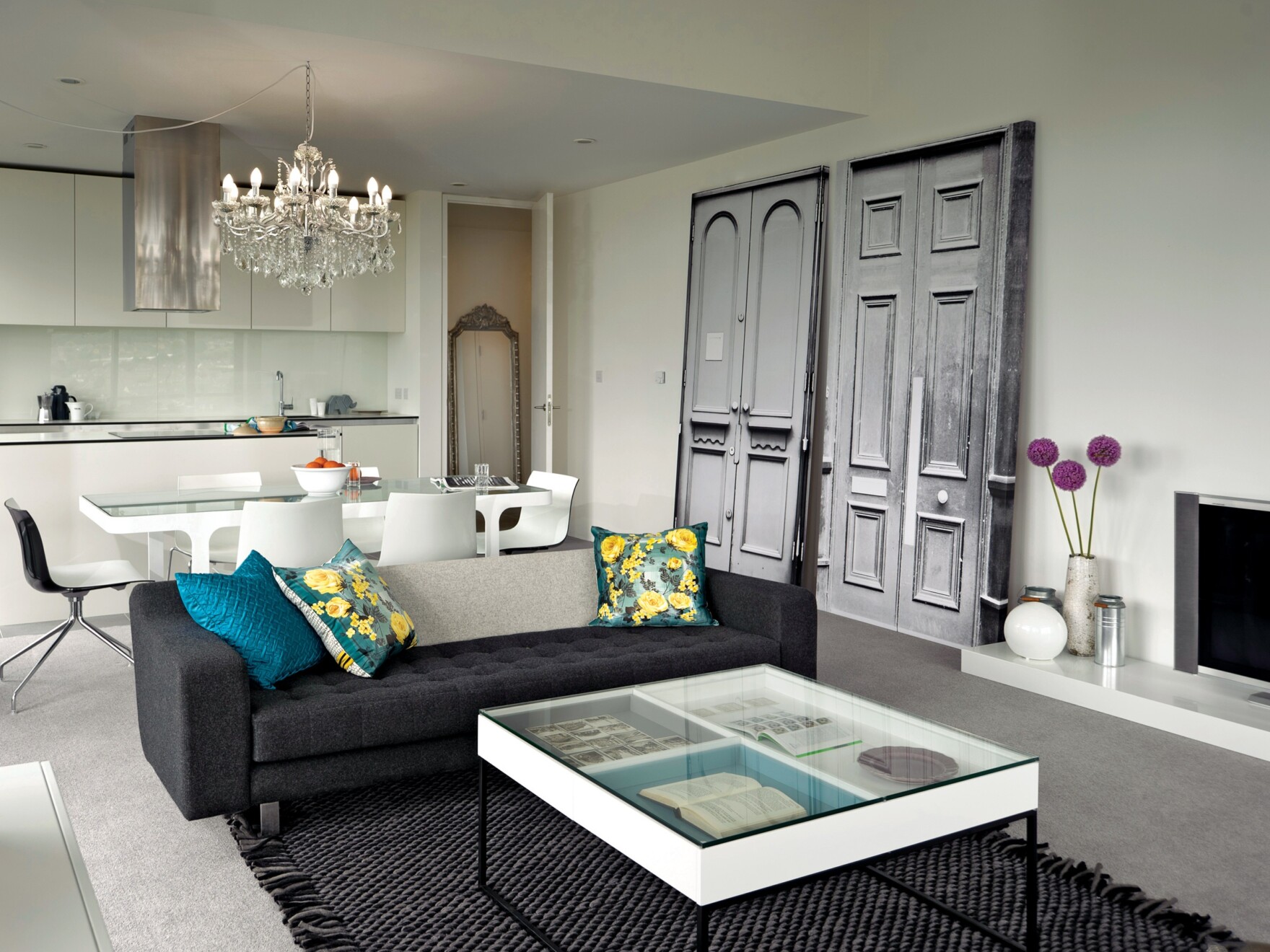
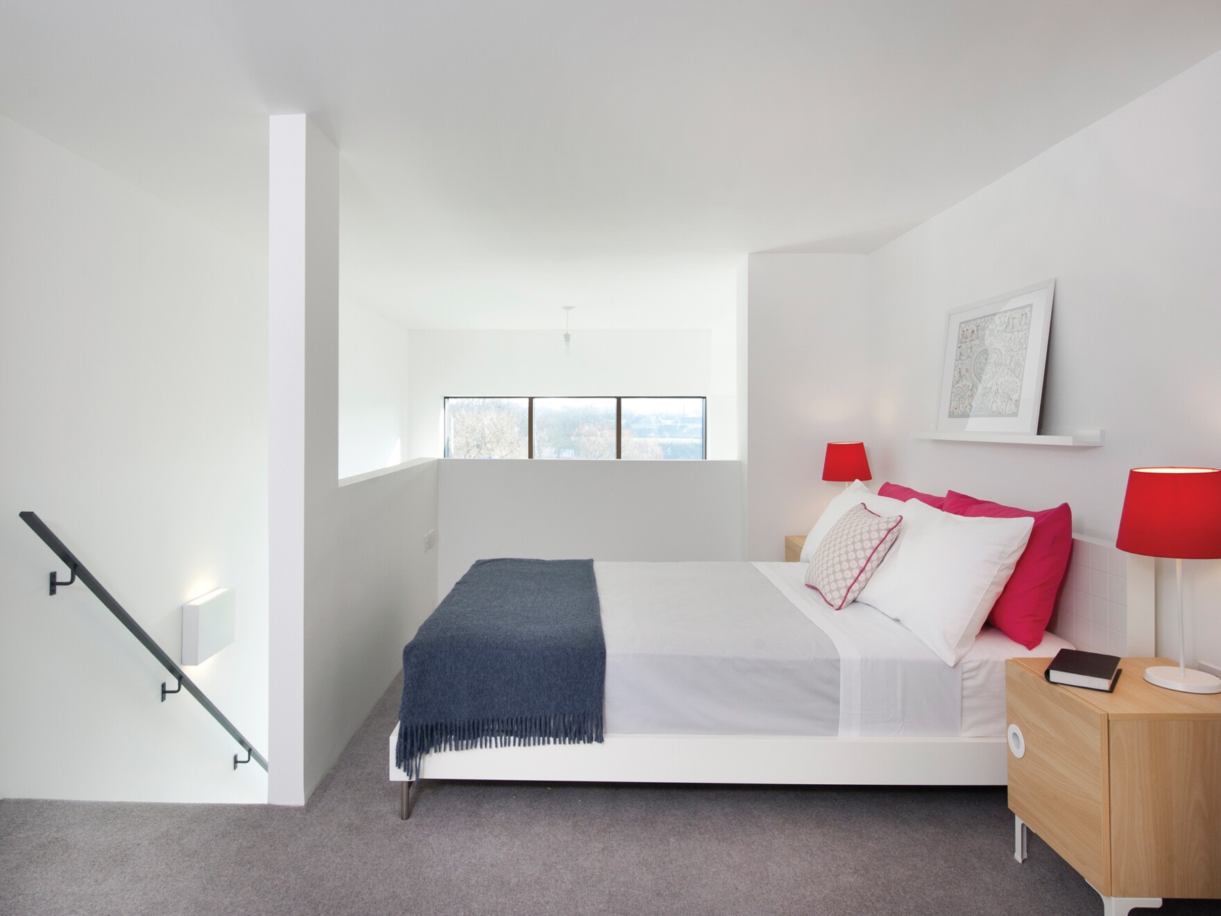
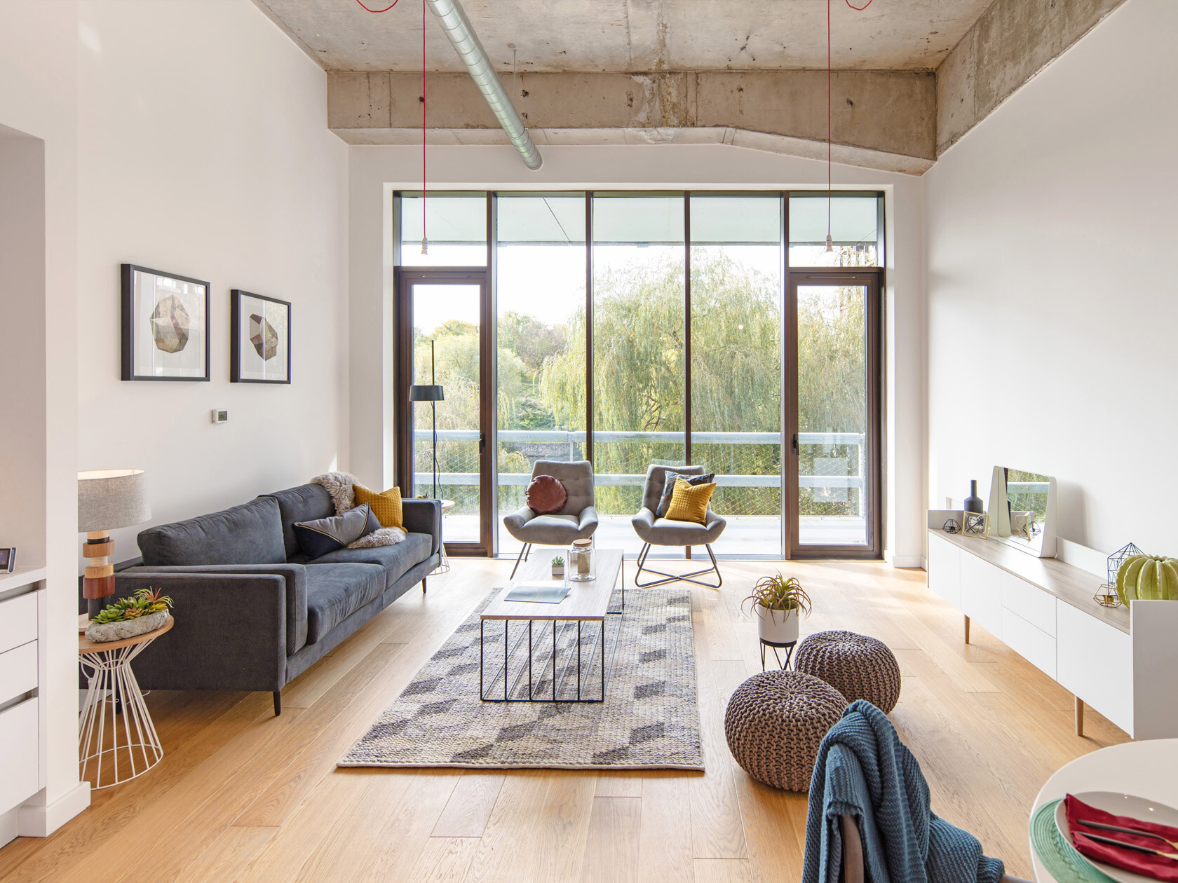
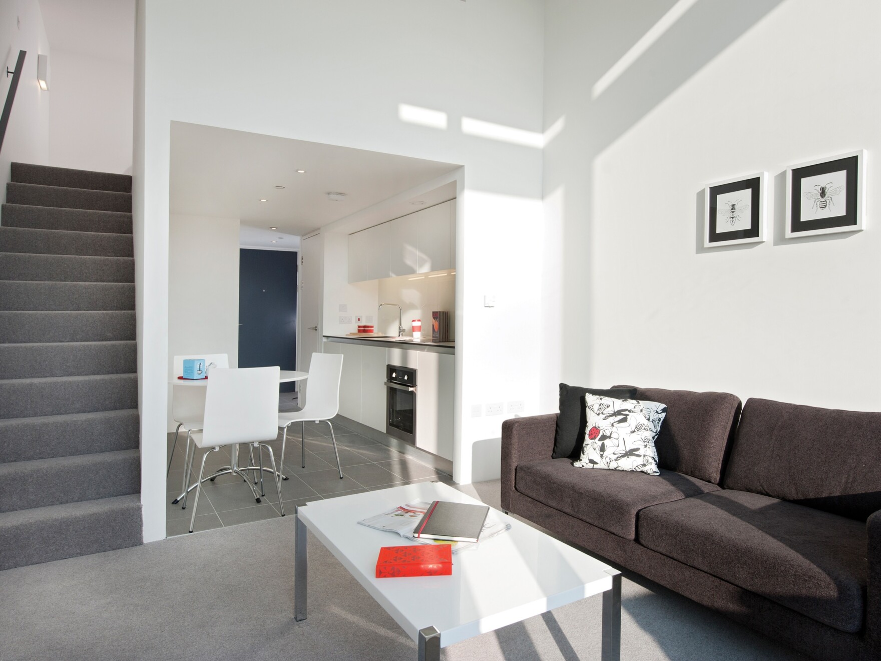
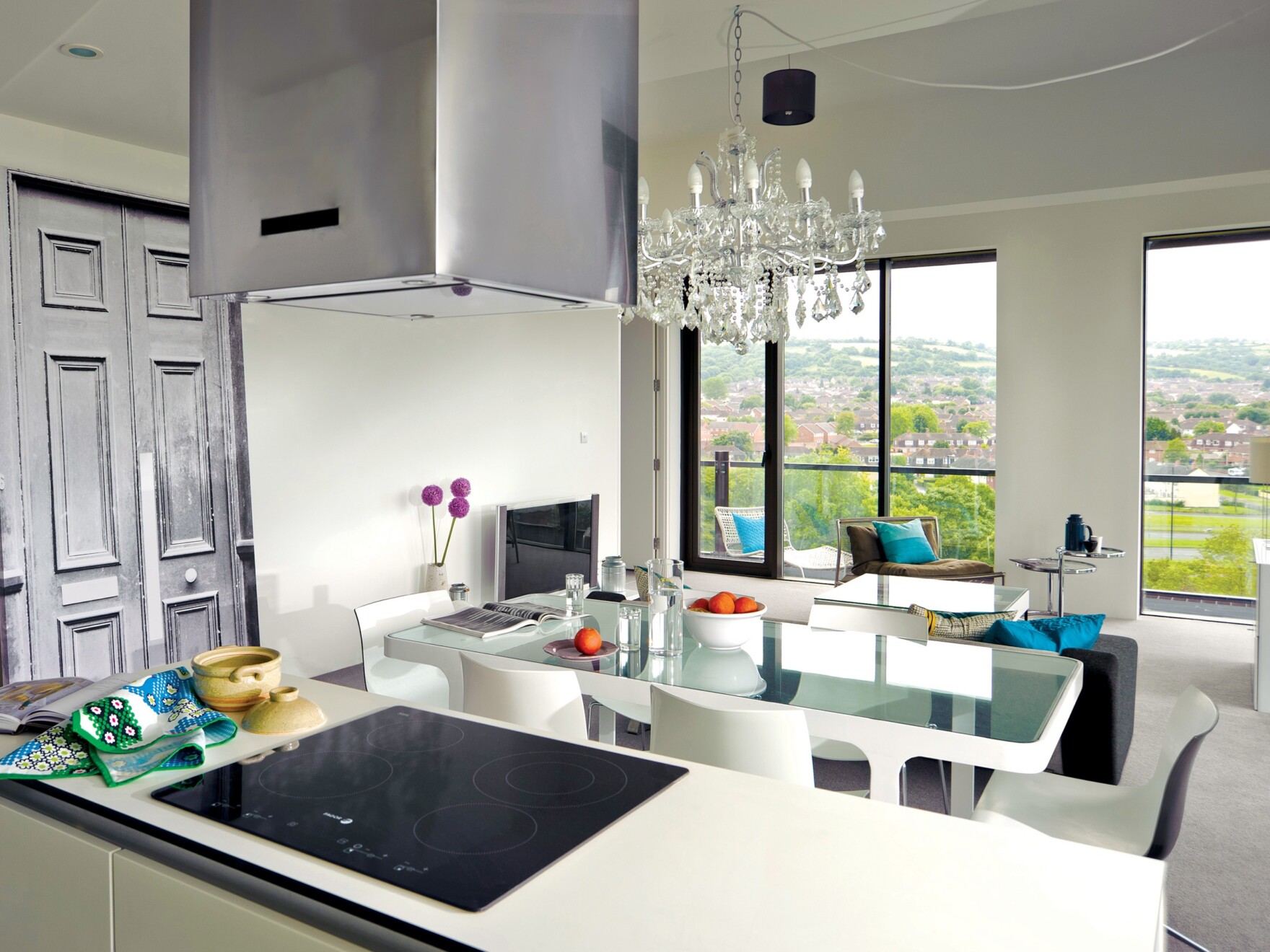
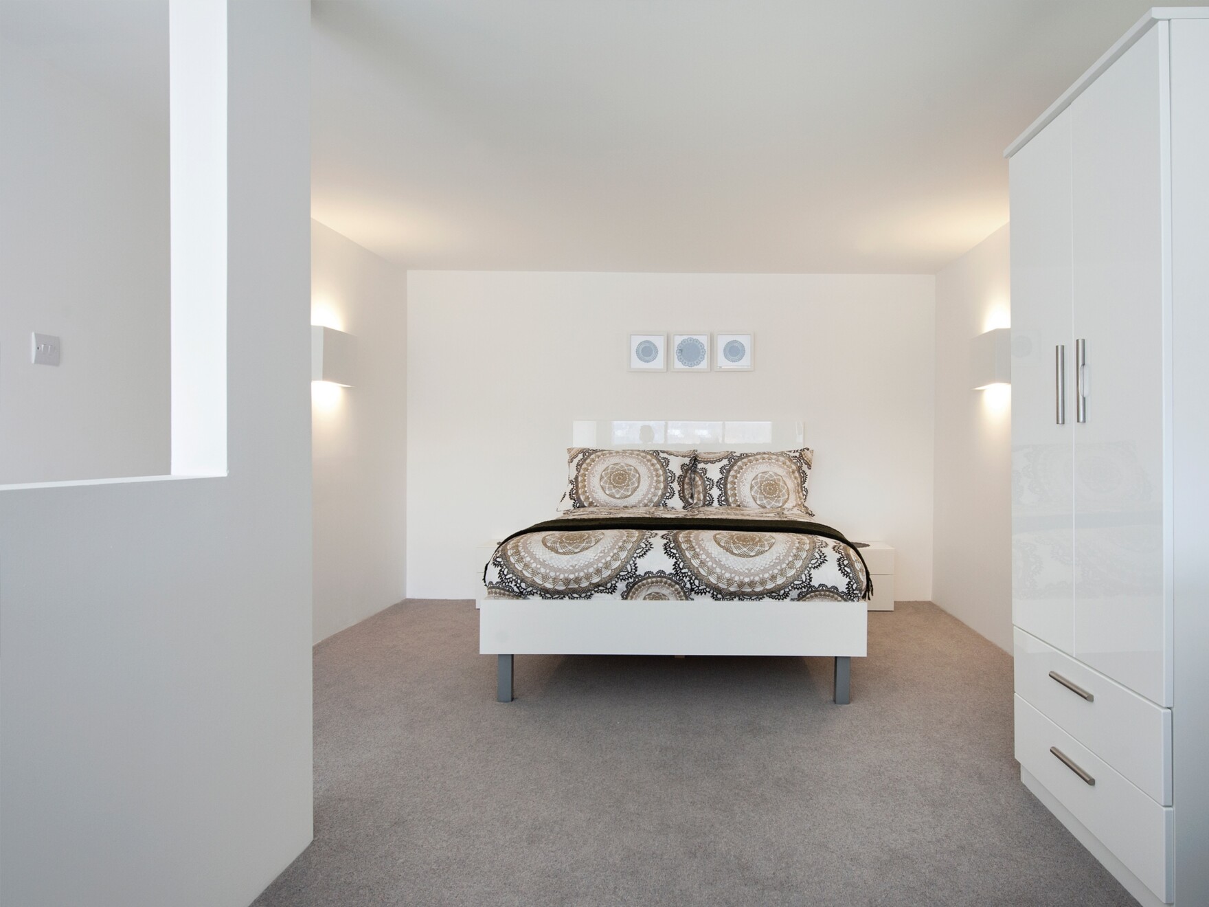
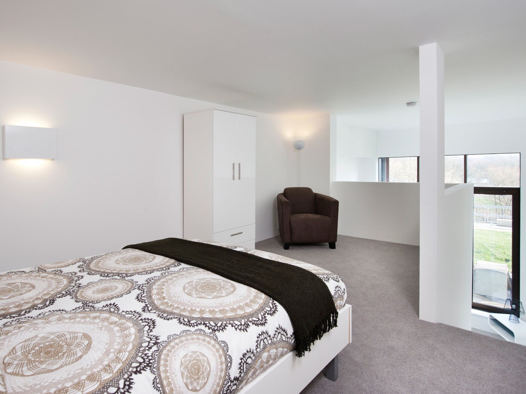
“A key move was the innovative section, a dual-aspect duplex that maximizes the number of south-facing apartments delivered, all with open plan living spaces ensuring residents benefit from natural light and stunning views across the lake. There is also a generosity of space on the south-facing balconies, each the full width of the apartment, meaning residents can really make the most of the views.”
What are your views on the impact of Mies van der Rohe, his architectural style and how it’s shaped schemes like this?
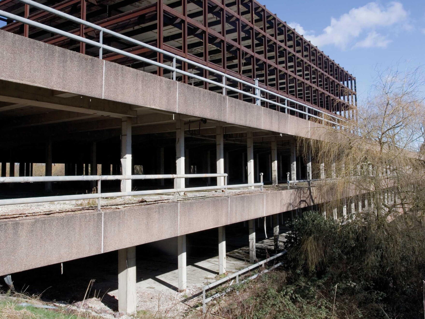
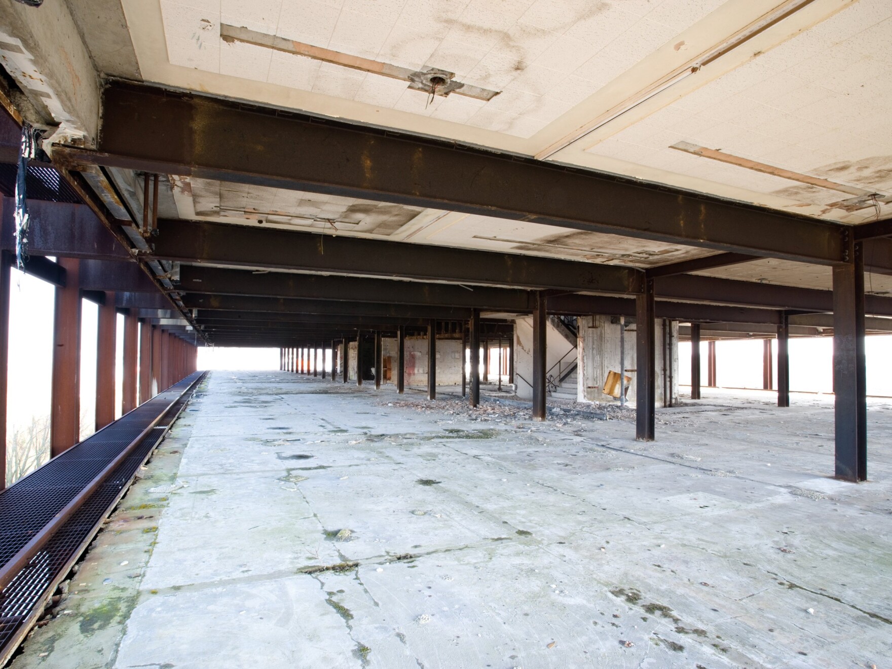
“The rigorous 3.6m wide structural grid that defined all elements of the Mies-inspired Phase 1 building was a key driver in the design of the Copper Building. However, we played with this principle to bring more variation in the façade with a mix of 3.6m, 7.2 and 10.8m ‘design bays’ offering a mix of 1-bed, 2-bed and duplex apartment types."


